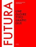
Futura, une gloire typographique
Alexandre Dumas de Rouly and Michel Wlassikoff
Among the various fonts that have marked the history of typography, it has a very front line position, right next to Garamond, Times or Frutiger. The Futura, designed by German painter Paul Renner in the twenties, is one of the most famous fonts without impasto, in the style inaugurated by le Caslon as of 1816. The book describes its extraordinary expansion, in the period that knew both the creative effervescence of the Bauhaus as well as Hitlers repression. Thanks to the international presence of the Bauer foundry that produced it (it has workshops in Barcelona and New York), the «print for our times» crossed borders. It would be used in the magazines Vu and Casabella, in posters by Jean Carlu, later in advertising campaigns for Volkswagen or in the major Italian department stores of La Rinascente, who had the nerve of bracking it together with the Bodoni font. Stanley Kubrick paid a huge tribute to it by using it abundantly in 2001 Space Odyssey |  |
Review published in the newsletter #216 - from 12 May 2011 to 18 May 2011
